
Fascinating! The Curatorial Process of "Go, Big Red.”
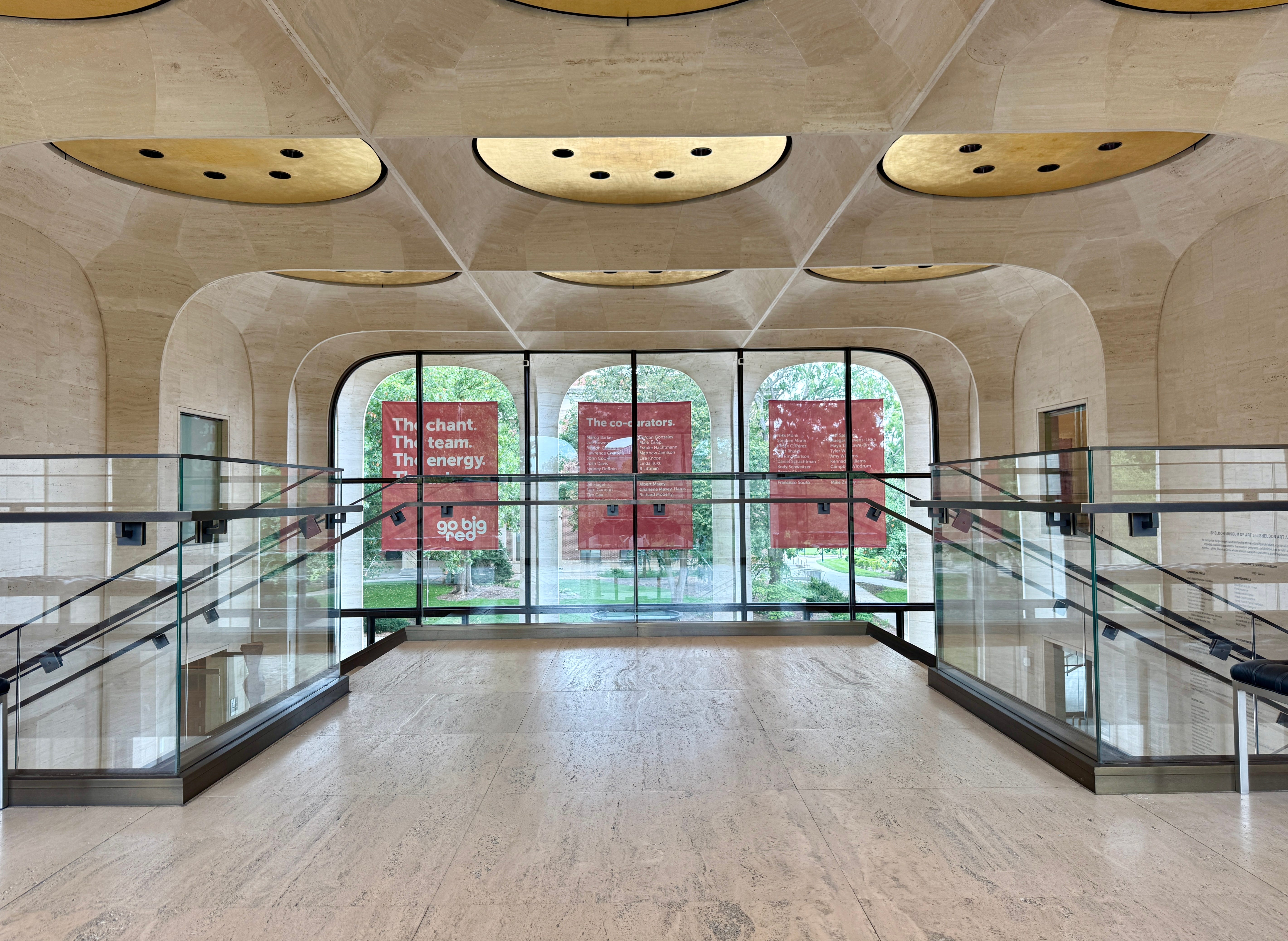
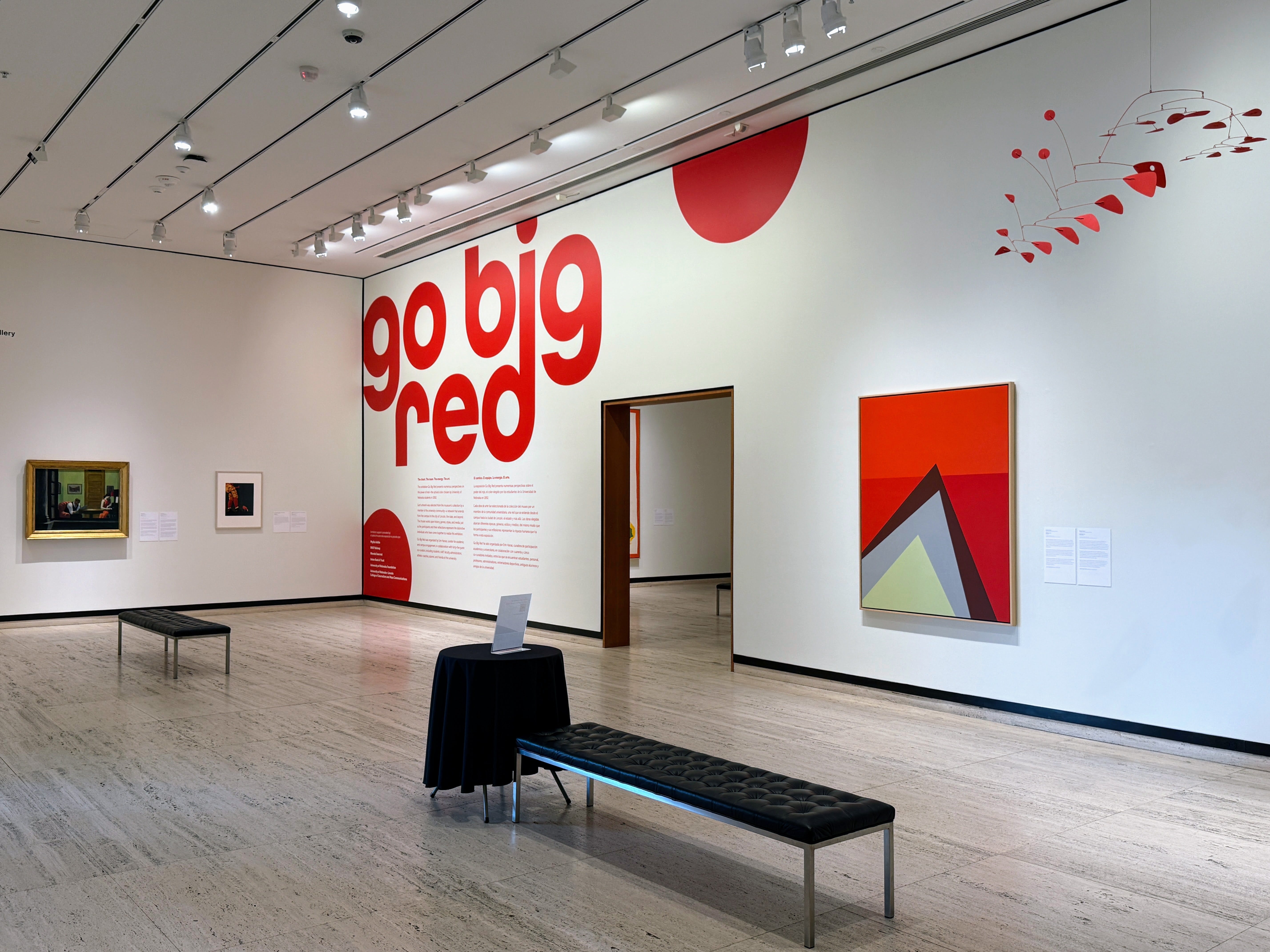
This exhibit at the Sheldon Museum of Art in Lincoln, Nebraska, features art that somehow incorporates the color RED, & was co-curated by UNL students, staff, faculty, coaches, alumni, and more.

I have long been fascinated by the curation of museum exhibitions. Why did the curator choose these particular works of art? How did they decide which pieces of art went where? Did they consider how two pieces of art speak to each other? Do they stand in the doorway of a gallery and imagine how each piece will look before any artworks are hung? Do they make preliminary sketches or 3D panoramas, or are they geniuses at imagining it all in their head?
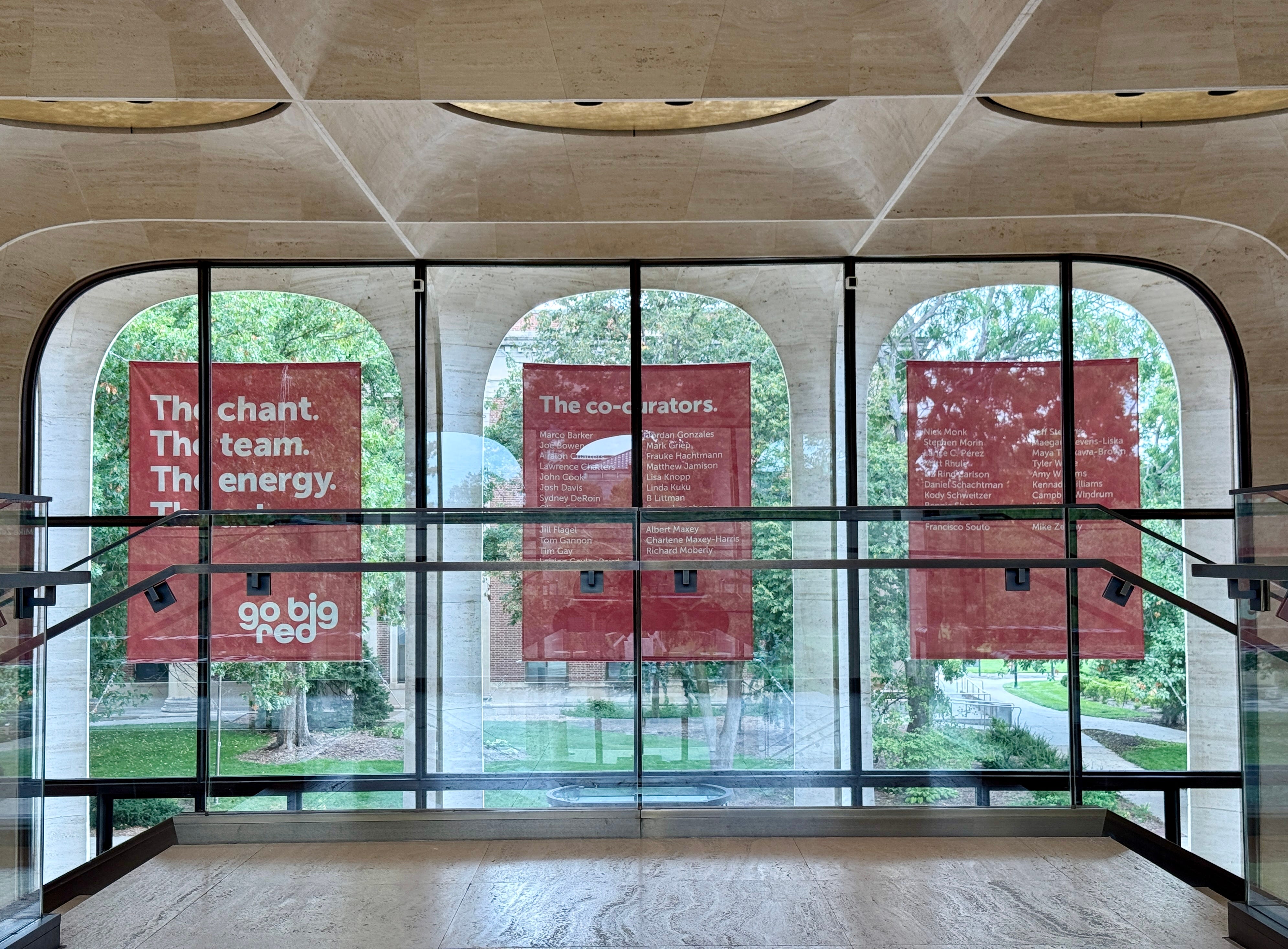
The “Go Big Red” art exhibit at the Sheldon Museum of Art in Lincoln, Nebraska, offered a glimpse into the curatorial process, showing how 45 works of art can come together to form a cohesive display. And it was all wondrous to hear about—the staff at the museum were especially effusive in their praise— and then to visit.
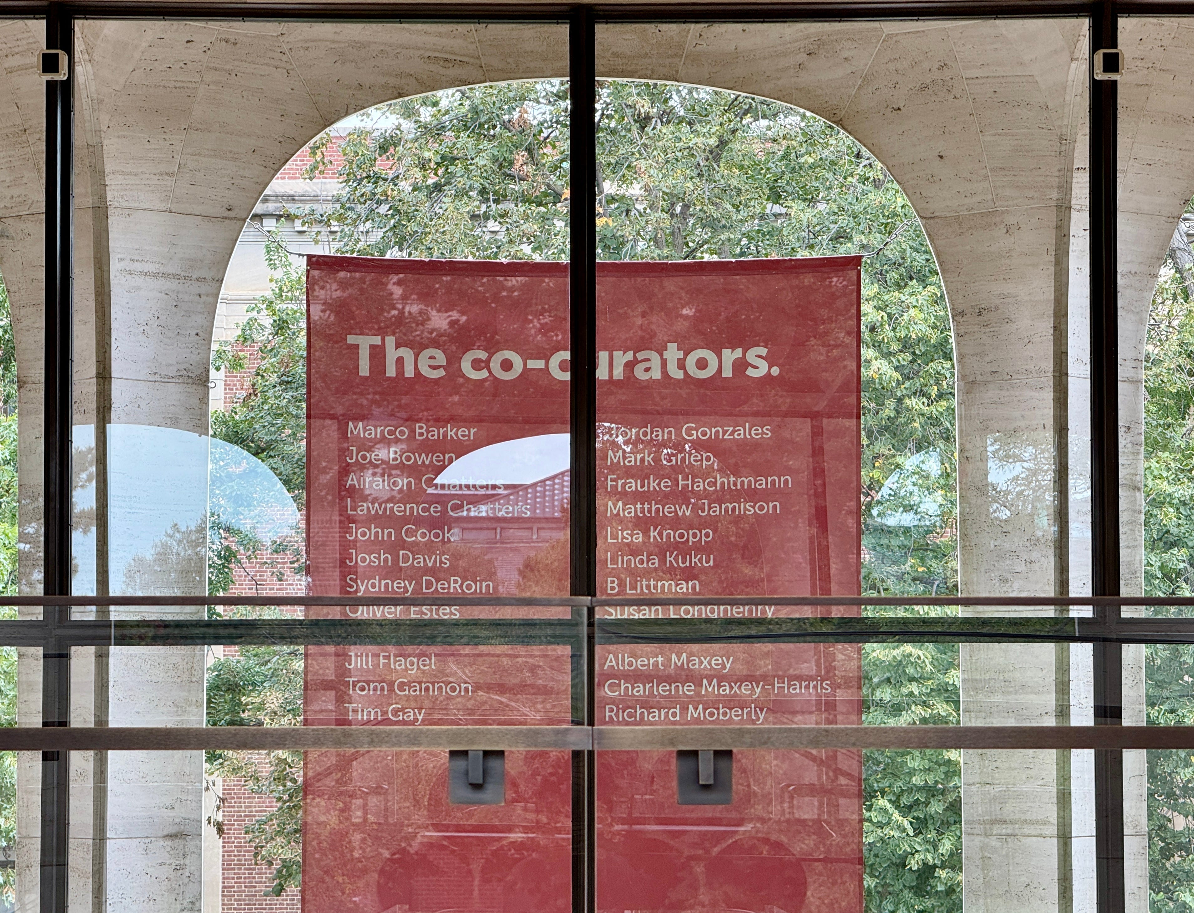
Go Big Red was organized by Erin Hanas, curator for academic and campus engagement, in collaboration with forty-five guest co-curators, including students, staff, faculty, administrators, athletic coaches, alumni, and friends of the university. — Sheldon Art Museum
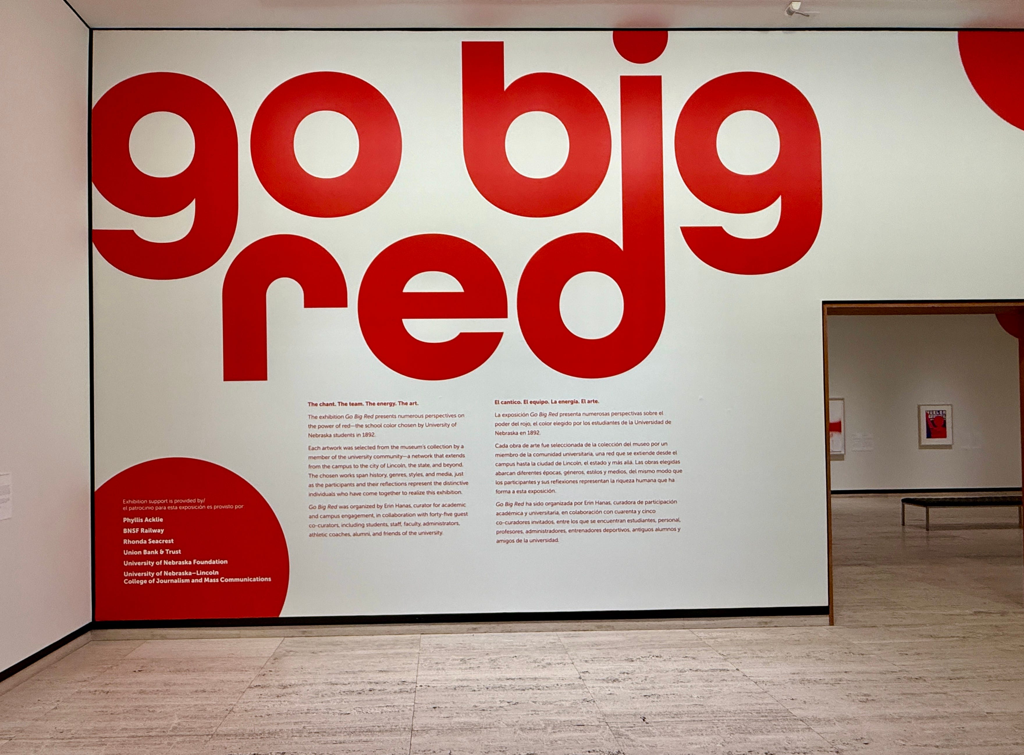
People from various life stages, interests, and artistic backgrounds answered the curator’s call (or email) to brainstorm this exhibit into existence. Forty-five people said yes to her request to co-curate this exhibit. Then each was sent a packet in the mail, featuring hundreds of possible pieces of art that were somehow connected to the color “red”. Each person was asked to choose one piece that spoke to them in a personal way, then write a short essay describing the “why?” of their choice. Each essay was presented next to their work of art. These enhanced the exhibit in wonderful ways—showing how a single piece of art can speak to a person and how art truly matters on a personal level.
When planning our road trip through the US Midwest, I read about this exhibit while browsing the various art museums on our route, and I was intrigued. I added Sheldon’s ‘Go Big Red’ exhibition to the places I most wanted to see, fascinated by the curatorial process. Neither Sherpa nor I was disappointed when we finally walked through the galleries.
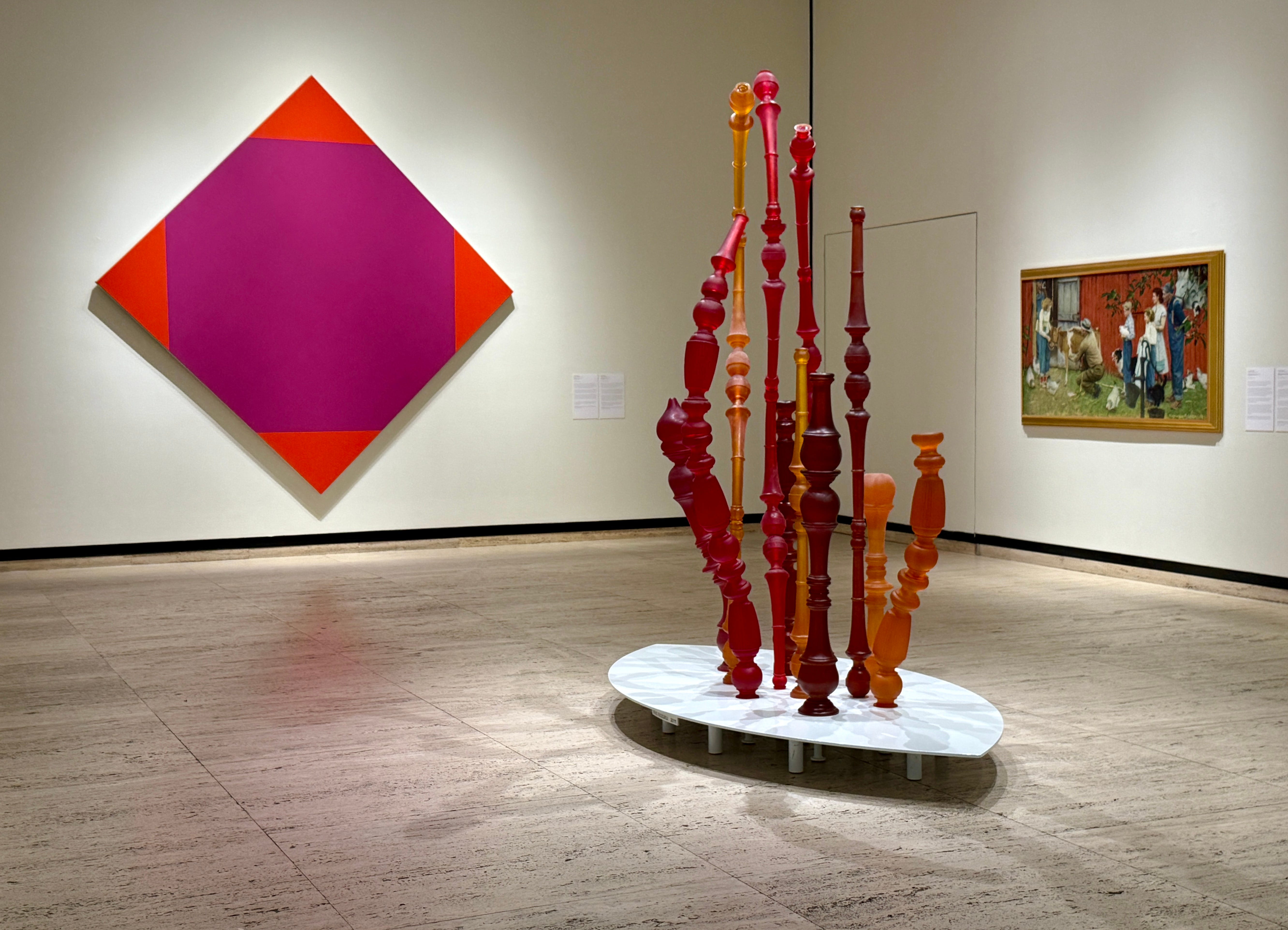
Sherpa and I photographed about half of the pieces in the exhibit. I’ll share the photos and a brief excerpt by the person who chose that piece. Hopefully, this will give you an idea of the power of art and the personal statement.
Both the subject and its photographic realization evoke a sense of beginnings -an entry point into visual language that reveals the enigmatic double lives of familiar objects.
--Francisco Souto, Director, School of Art, Art History & Design; Willa Cather Professor of Art
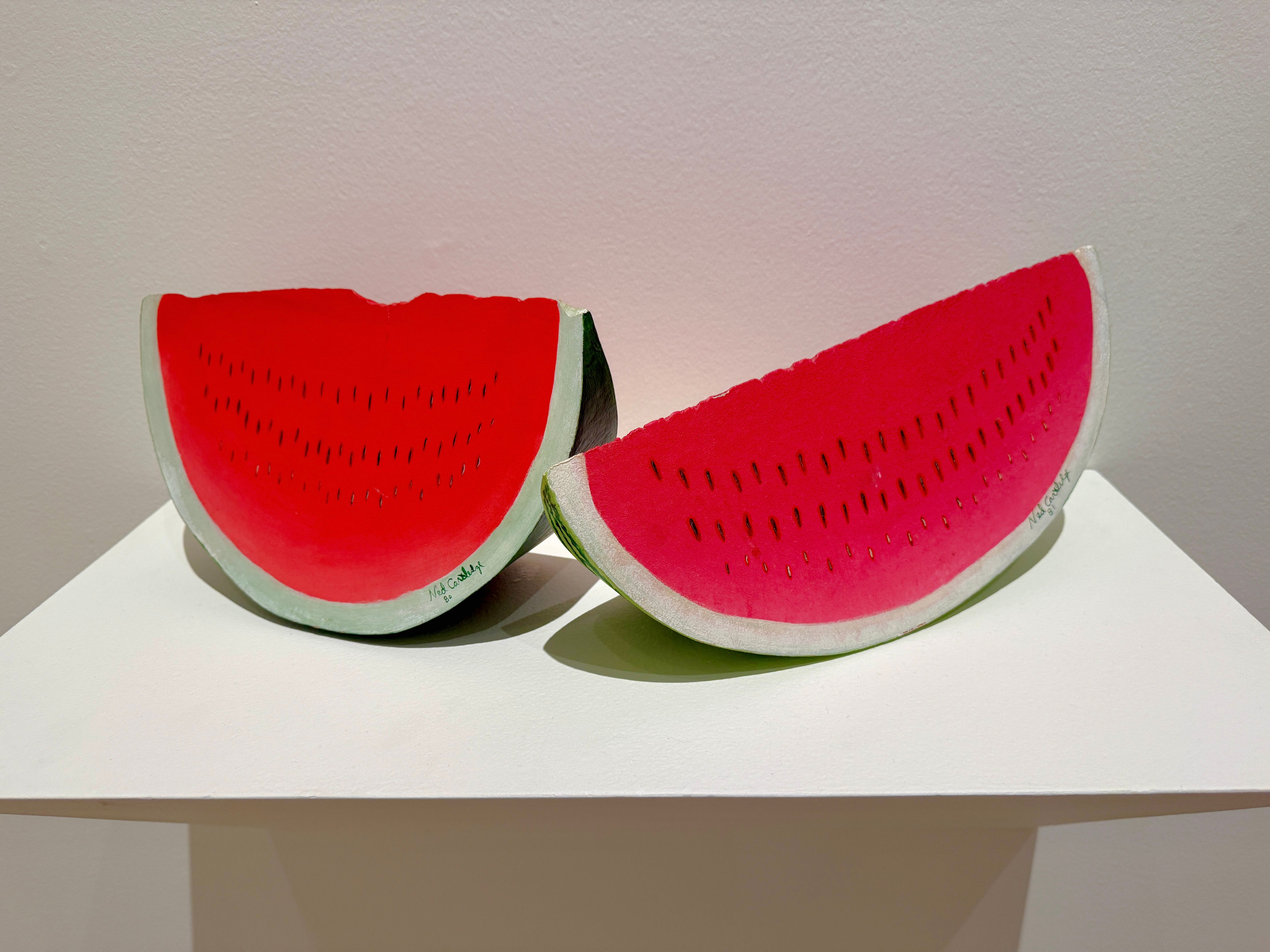
There’s something about watermelon that tastes like childhood and tradition. And in this sculpture, you can feel that. It’s not just about fruit — it’s about moments. The kind that stay with you long after the last sparkler burns out and the final pitch is thrown.
This work of art hits just like a walk-off homer: simple, sweet, and straight to the heart of summer.
—Kevin Sjuts, Sports Director, 10/11
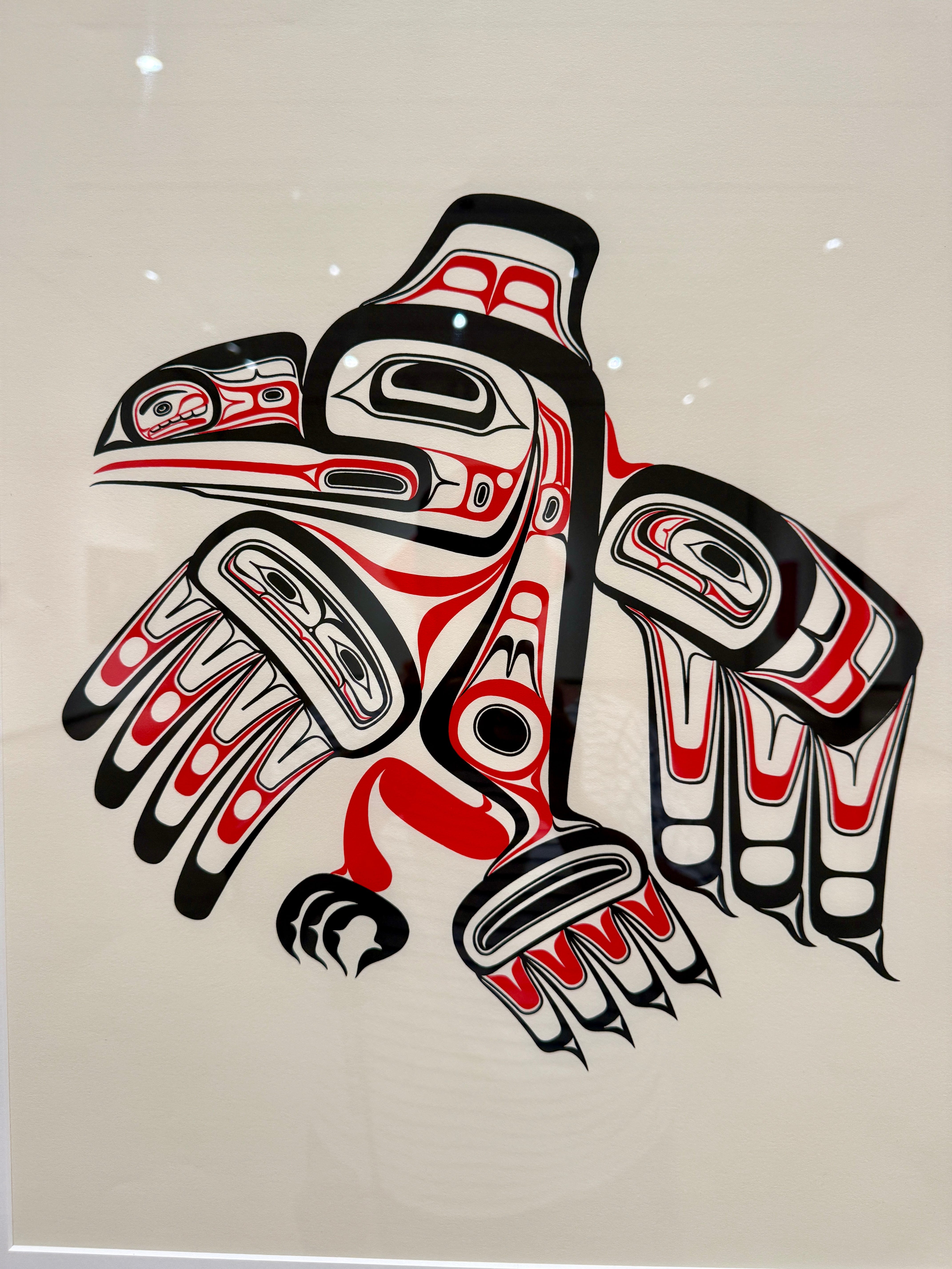
As a scholar of birds, I have long been delighted by the fact that the Trickster among Pacific Northwest tribal peoples is often a corvid — specifically, a raven or a blue jay. Bill Reid’s The Legacy: Raven presents a stylized raven, intentionally patterned after traditional Coast Salish art. I imagine the bird performing her crazy role as Trickster, simultaneously partaking in a ceremonial dance and strutting her laughing way towards standing civilization on its head.
—Tom Gannon, Professor of English and Ethnic Studies, Indigenous Studies
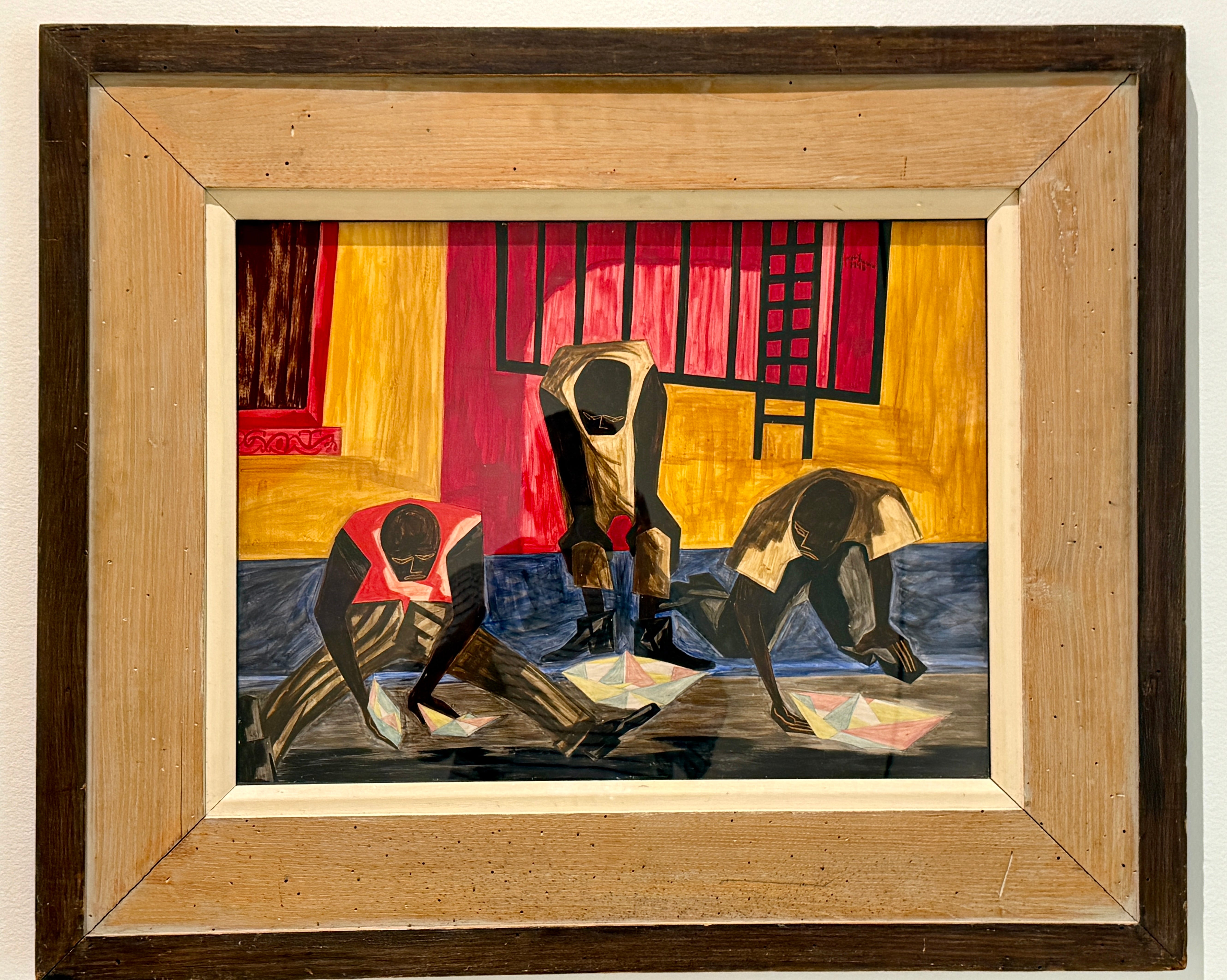
On the surface, this painting is of men collaboratively working together to make and sail paper boats. Looking deeper, we think of the experiences of African American student athletes in the early days of Nebraska, trying to make it. In our reading of the work, the boats - each one different, but all similar in construction - represent the students’ individual stories, dreams, hopes, and pathways to Nebraska…
—Albert Maxey (BA 73), Lieutenant, Lincoln Police Department, Retired, and Charlene Maxey-Harris (BS’83), Professor and Associate Dean, University
The first thing that struck me about this work were the footsteps that look like they’re taking a step into the dark. Leaving the colorful and warm comfort of the known for the sometimes frightening unknown. This image has a particular meaning for me as a Black woman-sometimes just leaving the house can feel like I’m stepping into a frightening unknown… The unknown remains frightening until one takes those first few steps, as daunting as they may be. For me this artwork feels like courage, like bravery…
—Linda Kuku (BJ’25), College of Journalism and Mass Communications, Broadcasting
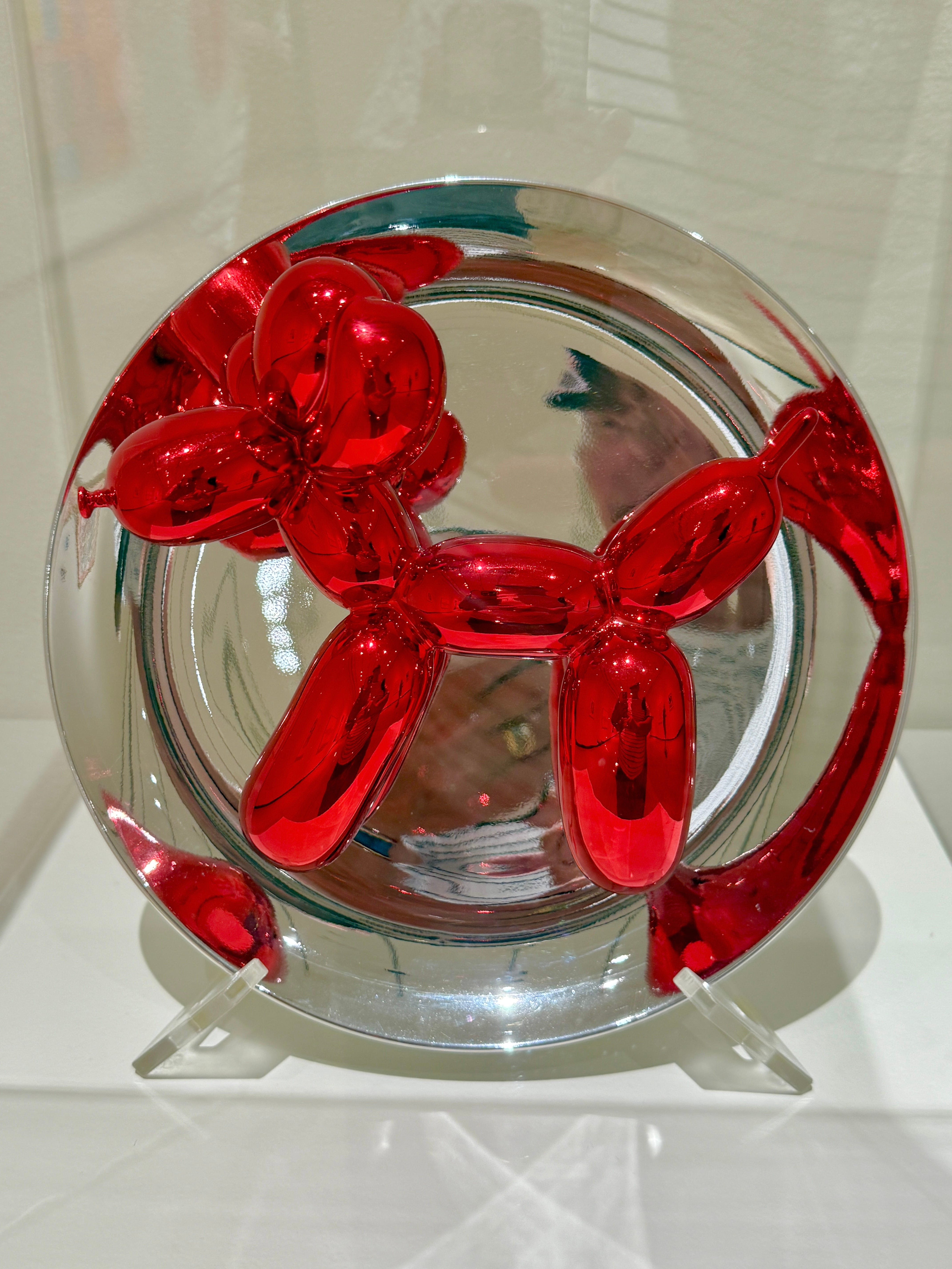
As a dog lover (and scientist), I enjoy seeing dogs in art. It reminds me of the unique role these animals play in our lives.
Sometimes we look to art for deep meaning and contemplation. Sometimes we look for joy.
—Jeffrey R. Stevens, Susan J. Rosowski Professor of Psychology: Director, Canine Cognition and Human Interaction Lab; Center for Brain, Biology & Behavior
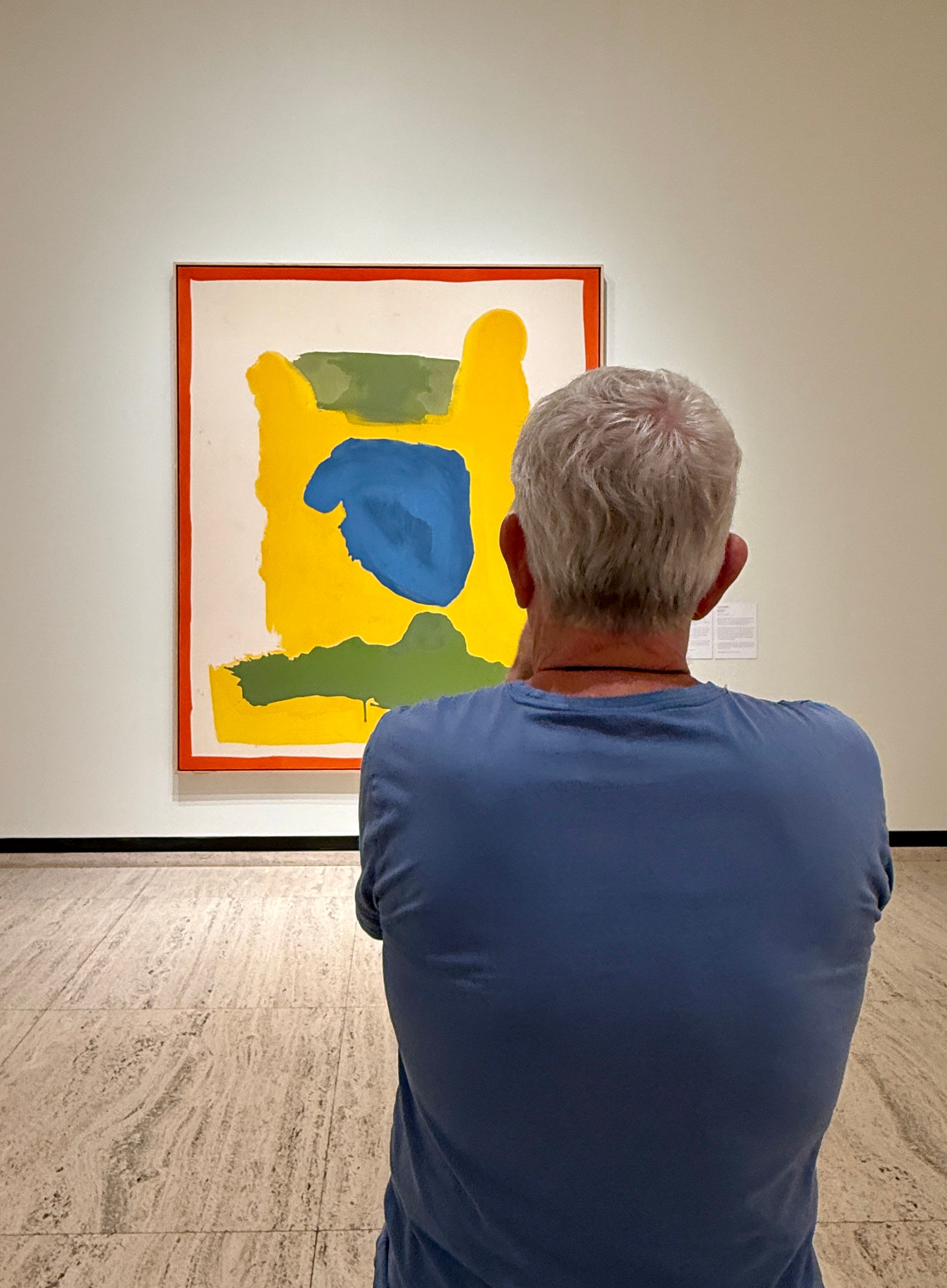
l appreciate that this painting was created by a highly influential artist who was a woman. Not only that, but a woman whose male counterparts were known to embrace a particularly enthusiastic brand of, shall we say, machismo. This painting and its creator, Helen Frankenthaler, stand in their own power…
The scale of this painting also contributes to a sense that we are encountering another being, one with a mind of its own. The red frame adds dynamic color and contains the action. To me, though, it’s also a visual pun. You think that paintings need frames? Well, here you go!
—Susan Longhenry, Director, Sheldon Museum of Art

Standing before Red Tondo, we are reminded: the path to greatness requires focus, creativity, and the courage to redraw the boundaries of what’s possible. Let’s level up together —Go Big Red!
—Amy Williams (BS’98), Head Coach, Women’s Basketball and Kennadi Williams, Student, College of Arts and Sciences, Women’s Basketball and Softball
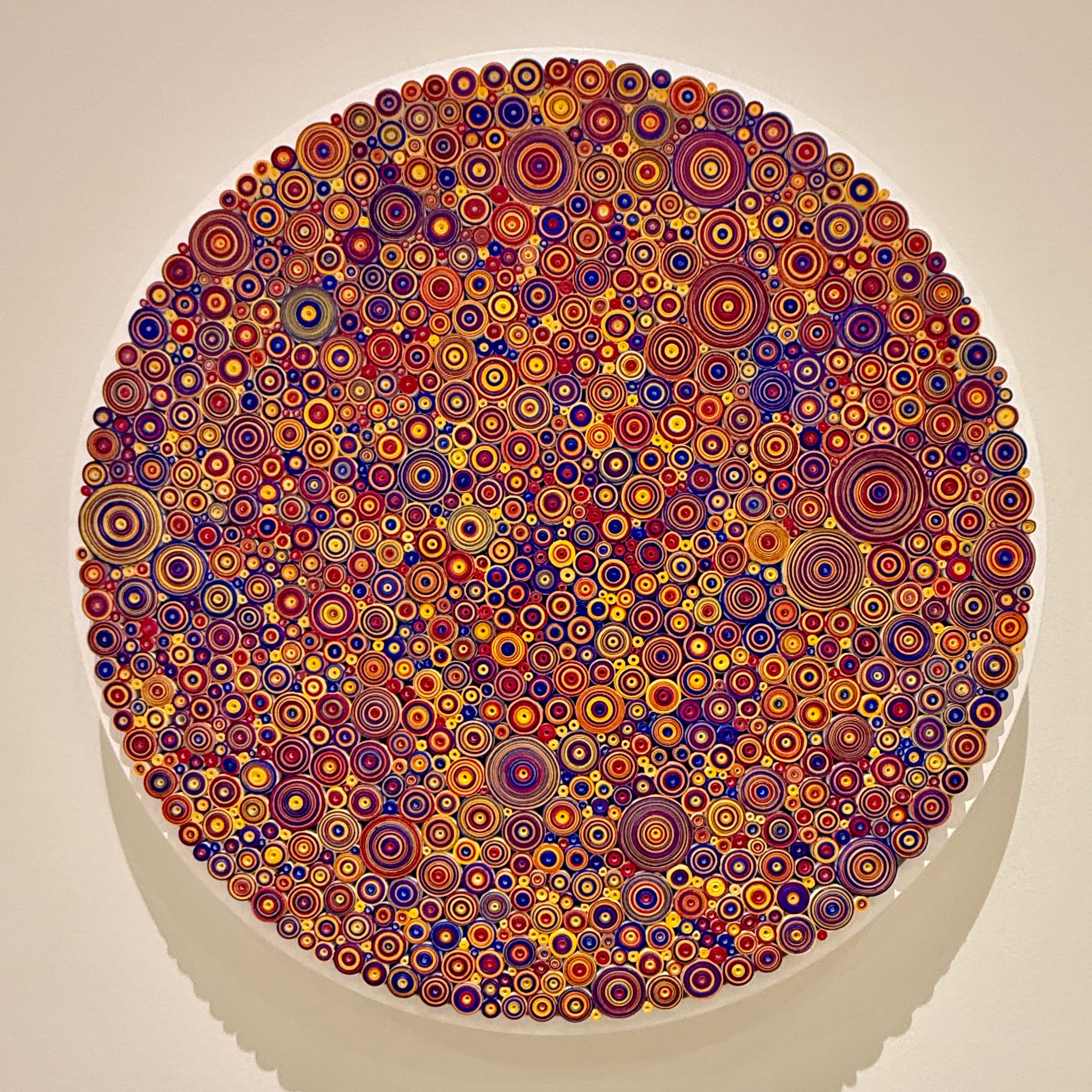
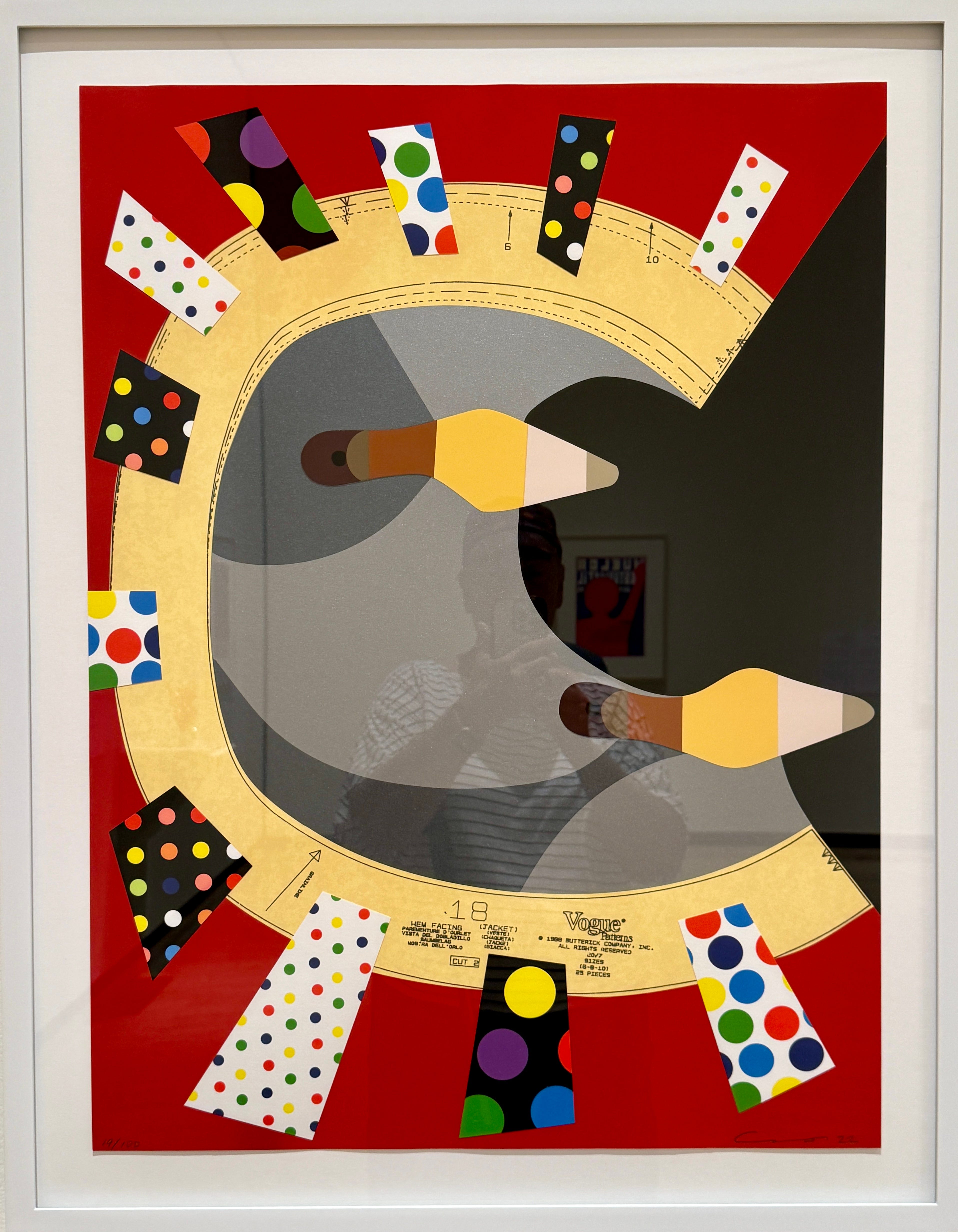
Upon first seeing a picture of this artwork, the colors and shapes instantly reminded me of the Aboriginal art I’ve come to love, specifically the dot paintings from our twelve years living in Australia…
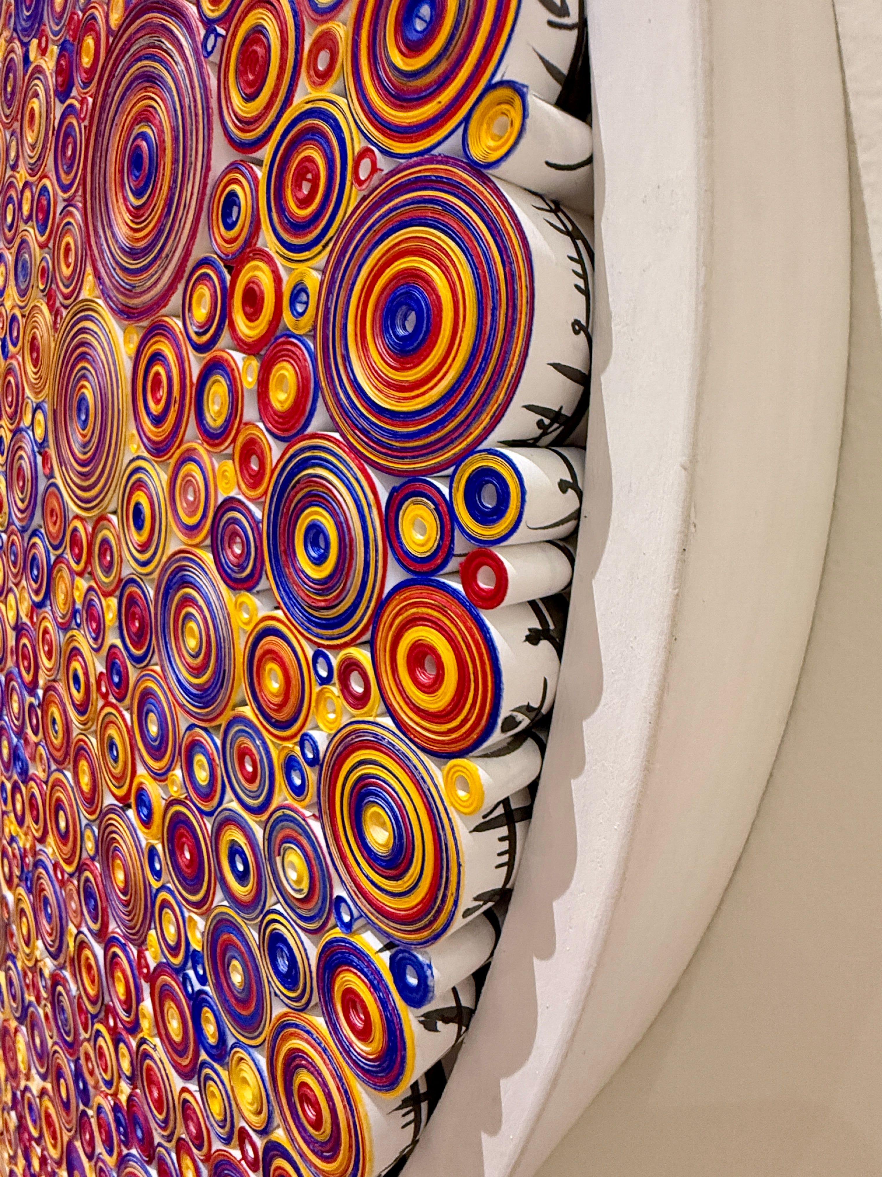
However, seeing the art in person evoked a completely different reaction. The colors still pop out at me, but in a different way. Seeing the work in person made me realize there is much more depth to it. From the side, you can see the writing on the scrolls; from the front, the vibrant colors are mesmerizing. The work is incredibly complex, making me wonder how the artist could assemble such a stunningly beautiful and intricate piece.
—Daniel Schachtman, Director, Nebraska Center for Biotechnology; and George Holmes, Professor of Agronomy and Horticulture
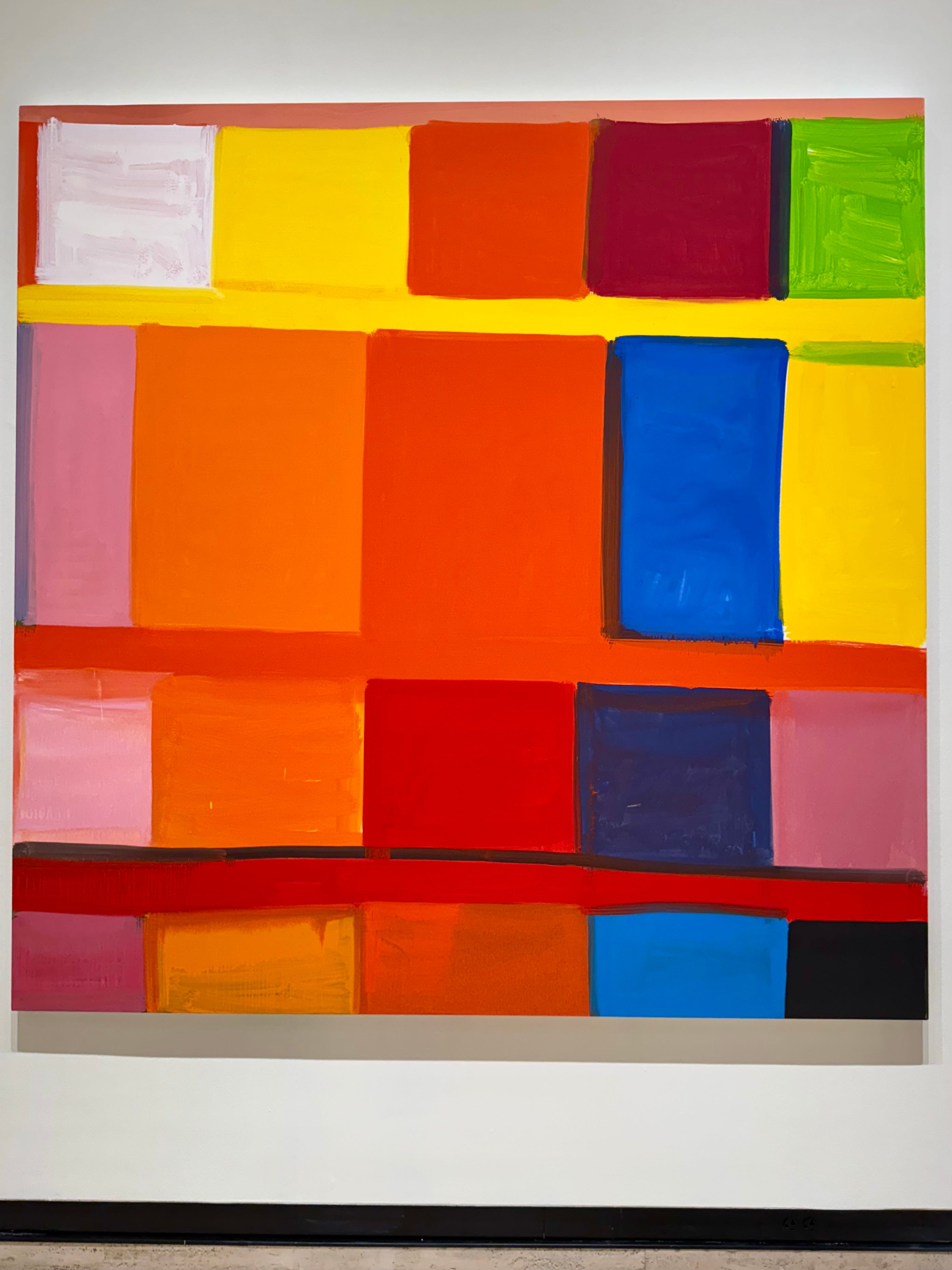
Why did Stanley Whitney call this painting Red when it’s the blues that are so captivating? Was it so we’d consider how the placement of the red amongst the oranges, blues, yellows, lavenders, green, white, and black affects our experience ol that color? Or so we’d consider how the scarcity of red makes us welcome that color where it does appear? But Whitney offers another explanation. “The difficulty for me in making these paintings is, if you fall in love with this red, can you get out of that red so that everything equals out and there’s no beginning or no end to it all?” That single color had so captivated Whitney that for him, there was no other.
—Lisa Knopp (PhD 93), Professor of English, University of Nebraska-Omaha and Meredith Ezinma Ramsay (BMus 12). Violinist
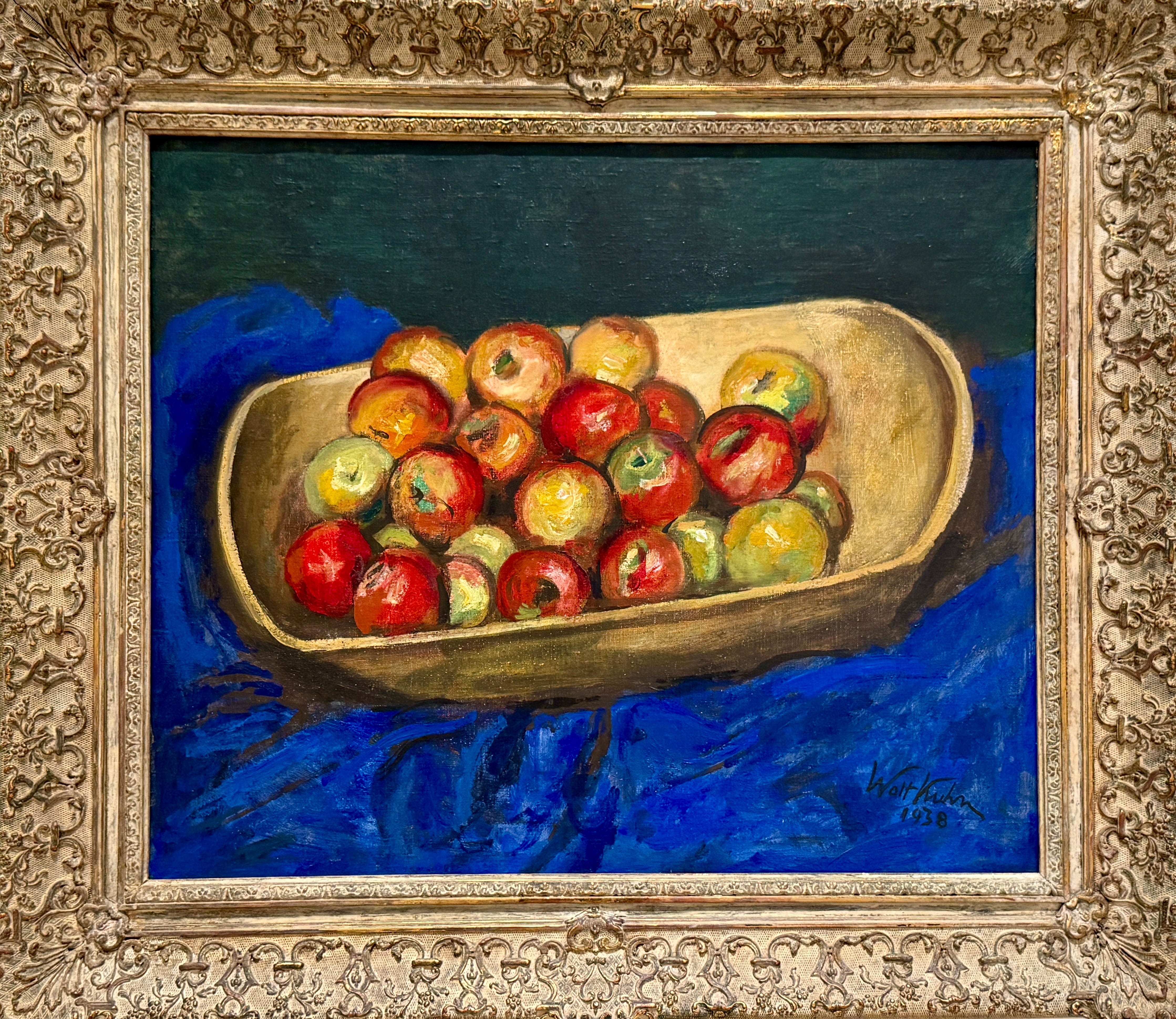
…Near my childhood home in Nebraska City are apple trees and an orchard that still produces apples. Just as looking at this painting conjures up memories from childhood, it also speaks to the future and all the wonderful things the University of Nebraska represents. When we say “Go Big Red,” we’re not just talking about sports. We are talking about the university as a whole and its outreach across the entire state to promote education, conservation, planting, and harvesting.
—Jill Flagel (BS 88), Director, Faculty and Staff Disability Services
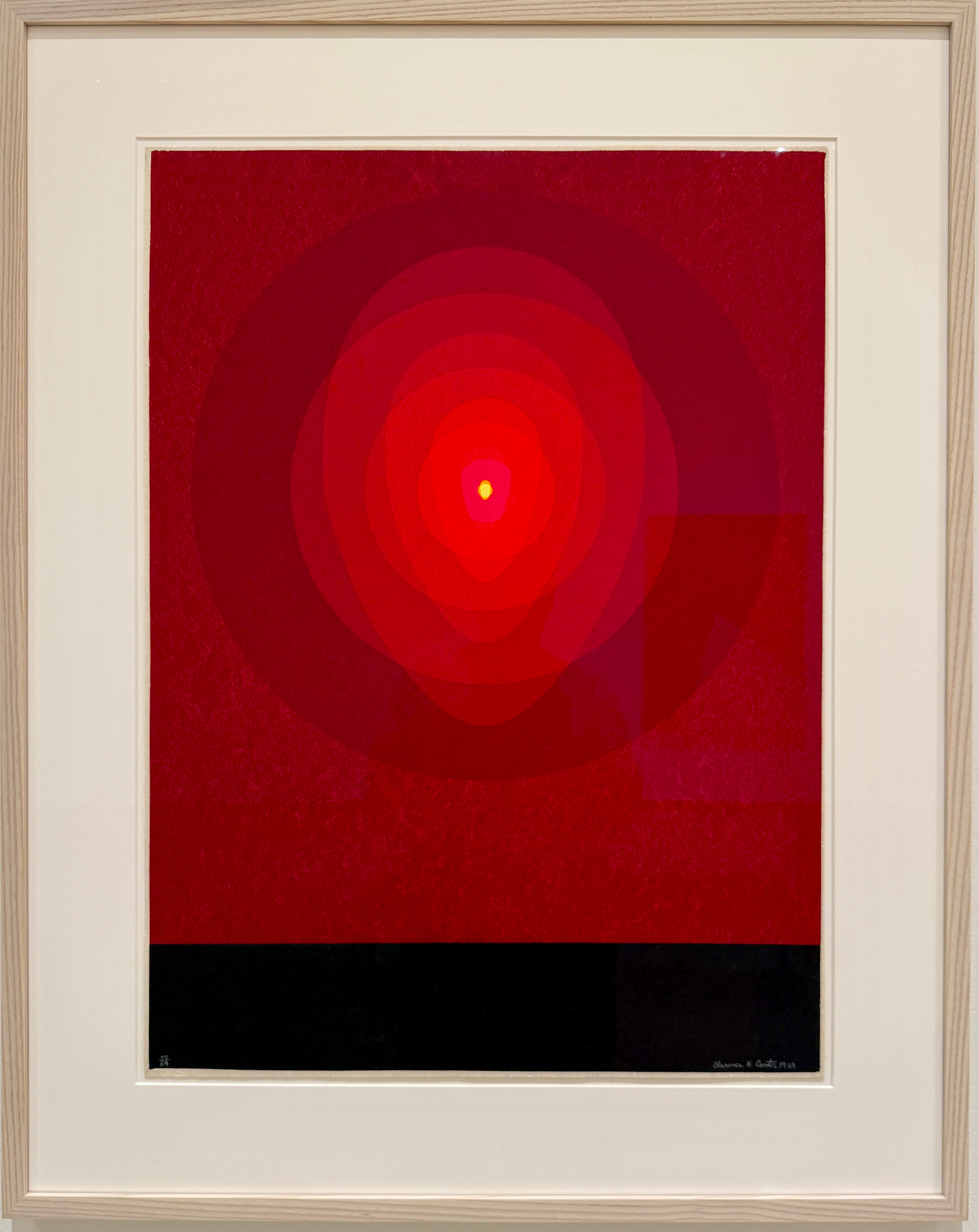
…The dramatic reds, something l usually associate with anger or unrest, draw me to the work, while the pseudo-concentric ovals and lighter shades of red lead my eyes to the small circle of light. The dark band at the bottom grounds the whole piece and provides a reference. It is as if the artist is asking the viewer to bring their anxieties, worries, and anger into a tunnel and then to gradually traverse it with the promise of light and hope at the end
—Lance C. Pérez, Fred Hunzeker Dean of Engineering; and Omar H. Heins Professor of Electrical and Computer Engineering
Known as the “mother of American modernism,” Georgia O’Keeffe has always inspired me, especially her work on colorful motifs reflecting her love of the American Southwest. I have found thoughtful beauty in her many different artistic expressions…
…I can use the space created by abstract and modern art to get students to explore the most fundamental of questions: Why? What do you see in this work? What emotions does it evoke? Explore your reaction. Ask yourself why it makes you feel that way. Take your time. You will learn something new.
—Tyler White (BA’03, MA’06, PhD 10), Faculty Director, Honors Program; Professor of Practice in Political Science; Director, National Security Program
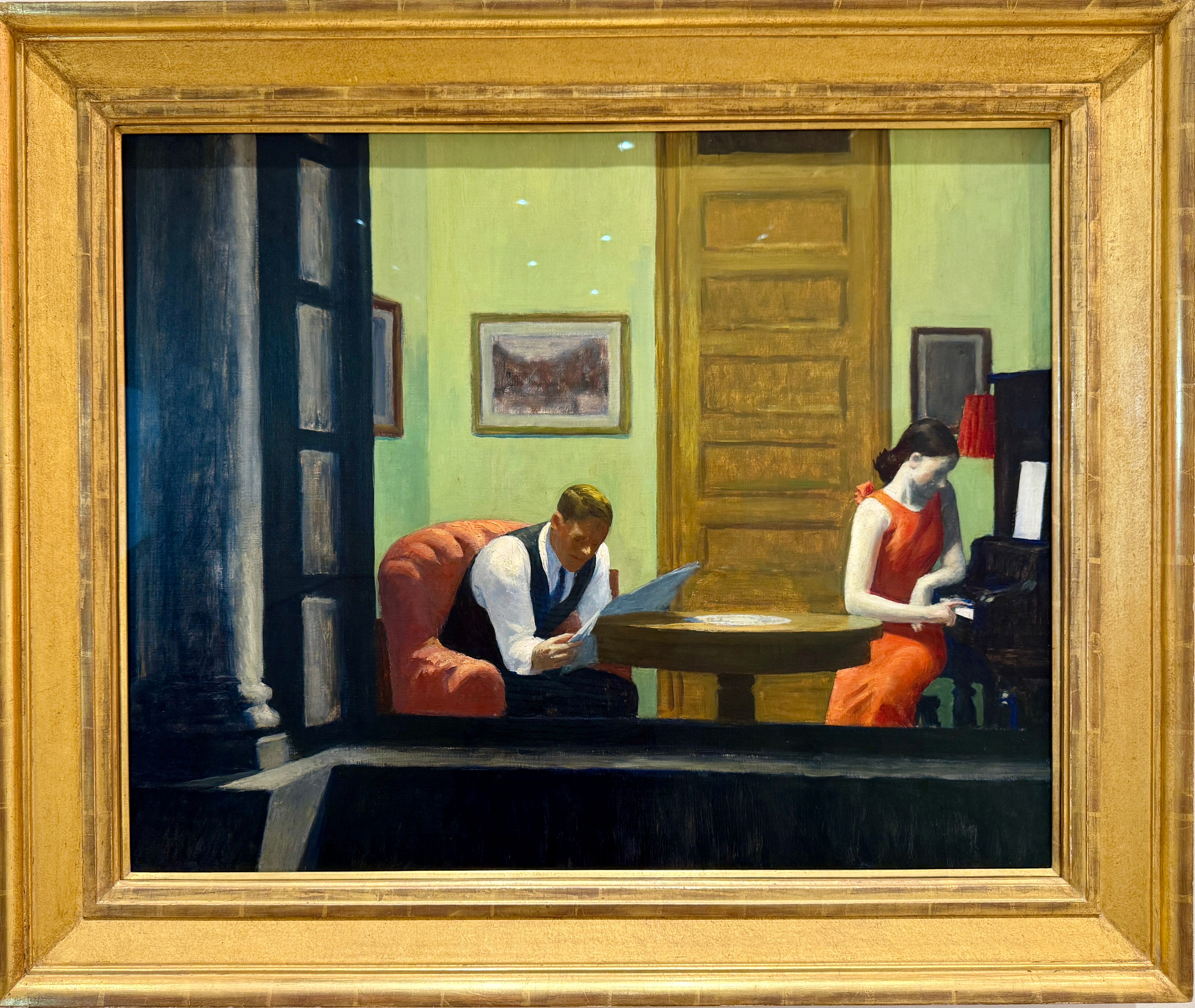
The newspaper. The piano. The solitude…
…This painting evokes a simpler time that we often long for — no electronics, no phones, no distractions —but an abundance of solitude that we enjoyed as we came of age at the end of the 20th century, the beginning and middle of which Hopper chronicled so masterfully…
—Jeff Zeleny (BJ 96), Chief National Affairs Correspondent, CNN and Mike Zeleny (BS ‘94, MBA’96), Vice Chancellor for Business and Finance
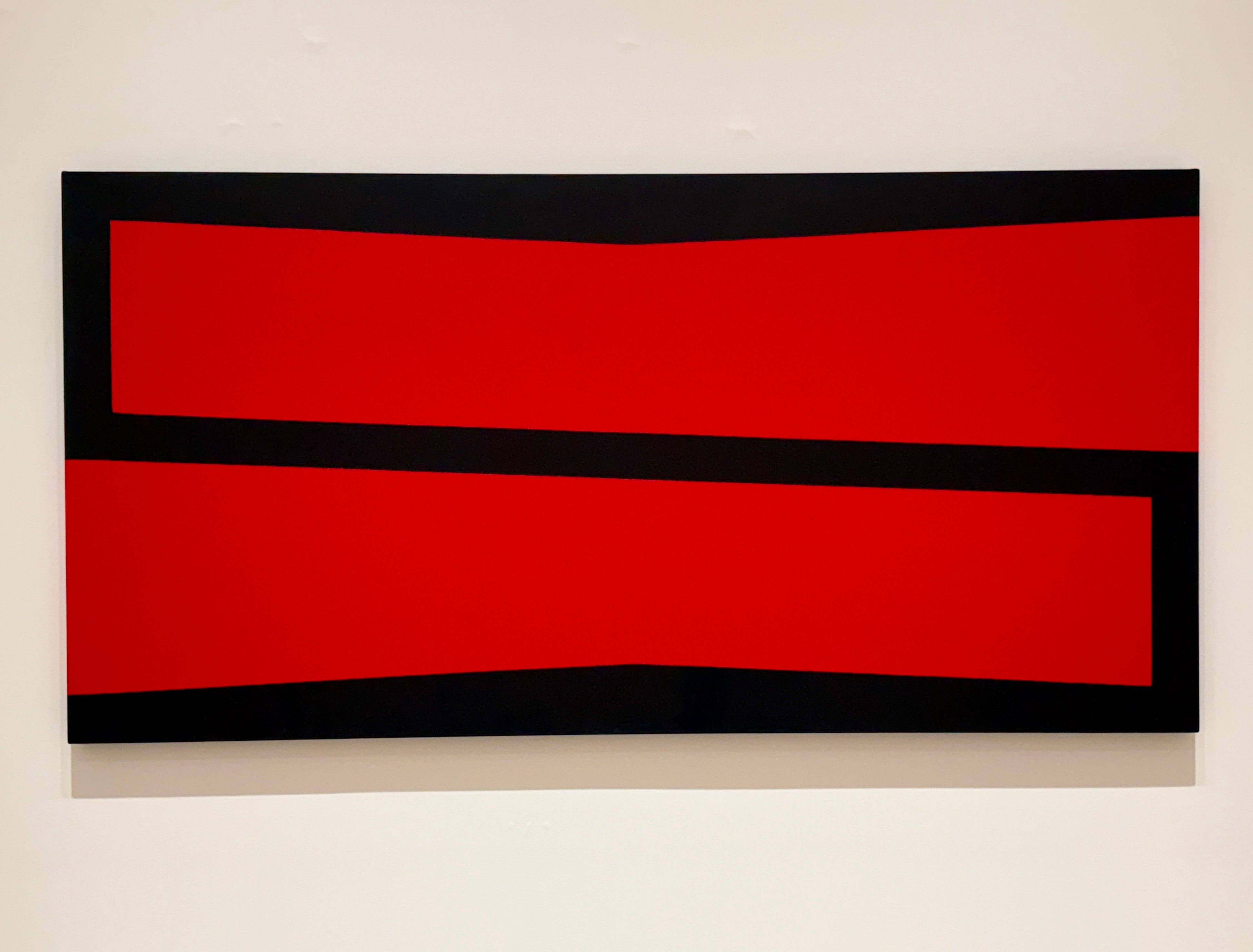
When I first saw Carmen Herrera’s Gemini, l immediately thought of the State of Nebraska’s motto, “Equality Before the Law.” I am pretty sure Ms. Herrera was not thinking of that motto, but I love the use of what appears to me to be an “equal” sign, although with odd angles and opposing slopes.
I like Herrera’s version better than a “normal” equal sign, a perfectly formed, mirrored shape of two exactly similar rectangles. As a lawyer and law professor, the idea of “equality” resonates with me as an obvious goal of our system of laws. Yet, this concept has been quite contested throughout American legal history and can take different meanings depending on the era and one’s perspective…
— Richard Moberly, Dean and Richard C. & Catherine S. Schmoker Professor of Law
I do hope you enjoyed that in-depth exploration of a campus/community co-curated art exhibit. I continue to think about the choices of artwork and how it could so easily be done at other university and college galleries. What would a blue and gold exhibit look like on the campus of Notre Dame? What art might be in a purple and white exhibit on Northwestern’s Evanston campus? Michigan? Cornell? Arizona?
Almost every school of higher education has its own school colors, as do high schools and even elementary schools. I love the idea of campus and community members coming together to co-curate an exhibition. What school colors can you imagine coming to life in an exhibition near you?